
THE STORY OF
MY FAVORITE PROBLEM I HAD TO TACKLE FOR MEVZU
dsmfdsldsjkfdl
dsmfdsldsjkfdl
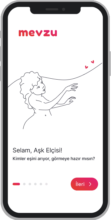
WHAT IS A MEVZU?
It was said to be a dating app, when I was first introduced to it.
And to give context to those who did not use a dating app before, here goes nothing:
A dating app promotes the profile you create for yourself to other users on a mobile screen. If you fancy another individual’s created profile you swipe right, and if that profile swiped you right, you match.
However, Mevzu was striving for a different mental model than that.
On Mevzu homepage, you are introduced to couples that haven’t met before. You swiped them right, if you think they are a good match, you swipe left if you didn’t. And if you fancied any of those profiles, you could create a campaign for yourself.
To communicate this difference was the biggest problem Mevzu needed to address, mainly because the team had not even realized that their problem statement was wrong which was leading to targetting the wrong audience.
But this post is not about how to find a match on Mevzu; it is about what seemed like a technical bug, but turned about to be a UX problem.
This is the story of the case I called the gender confusion. dfsd
şadfks
THE CASE, THE BUG: A.K.A The Problem
While running concepts tests, we discovered that once every while, you could see two straight men introduced as a potential match. After digging a little deeper, we found out that some male presenting profiles was represented as cis woman. First, it was thought to be a problem that the match engine was rendering, but we quickly realised that these profiles marked themselves as woman. But how was that possible?
AND MIND YOU, by that time, we did not cater to all sexual orietations, I mean, WE were very much hetero, for reasons I will not try to justify now.
Something was off.
şadfks
THE PERSONA: UNCLE
To introduce you the problem, first I have to define the group who were the subject and the object of this problem.
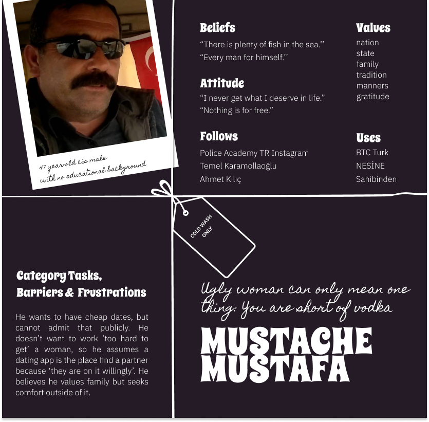
The Uncle was not tech savvy, and had very little patience and background to learn novice ideas.
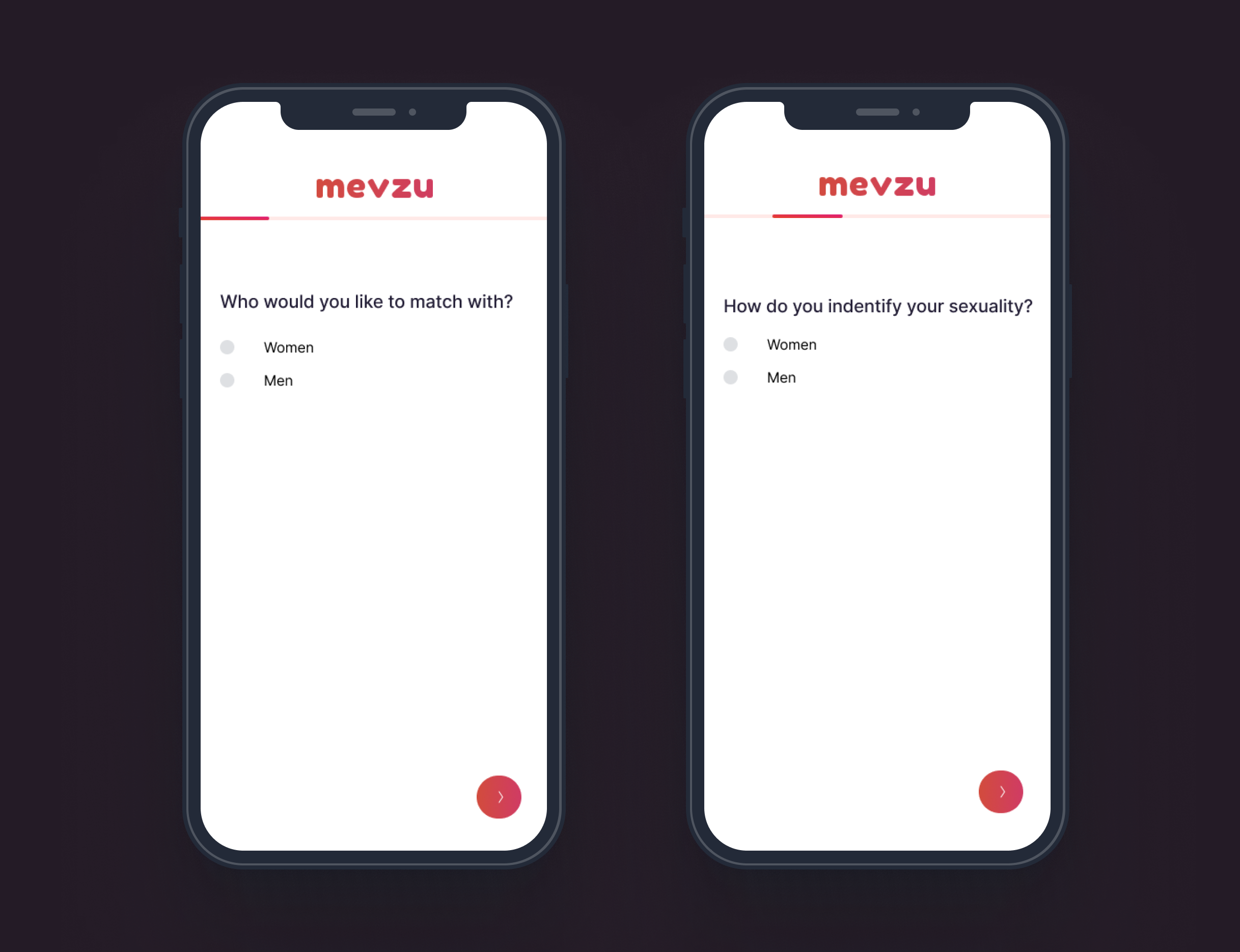
Through the onboarding flow, the following two screens were introduced back to back with each other, creating an illusion that they might be the same screen, because their questions have the exact same options.
Mustache Mustafa click the option ‘Women’ on both screens, thinking his first click did not work because of poor UI and animation, which rendered him as a woman, looking to match with women.
şadfks
THE PROBLEM STATEMENT
When I run the onboarding job to be done that we had, I noticed that questions that collected gender and sexuality data were divided in two pages in which without the UI animation, they looked like twins and interacted as glitches:
I mean, obviously I want to remember this flap as I had no part in it. But it was not the case. I was already involved with the project at least for 4 months before we were interrupted by this case. We were nowhere near the final product we were envisioning yet, neither in terms of USP not onboarding the community we desired so much to cater, when we once more needed to understand that so little of our community was into reading any text at all. Well, no surprises there…
THE FIX
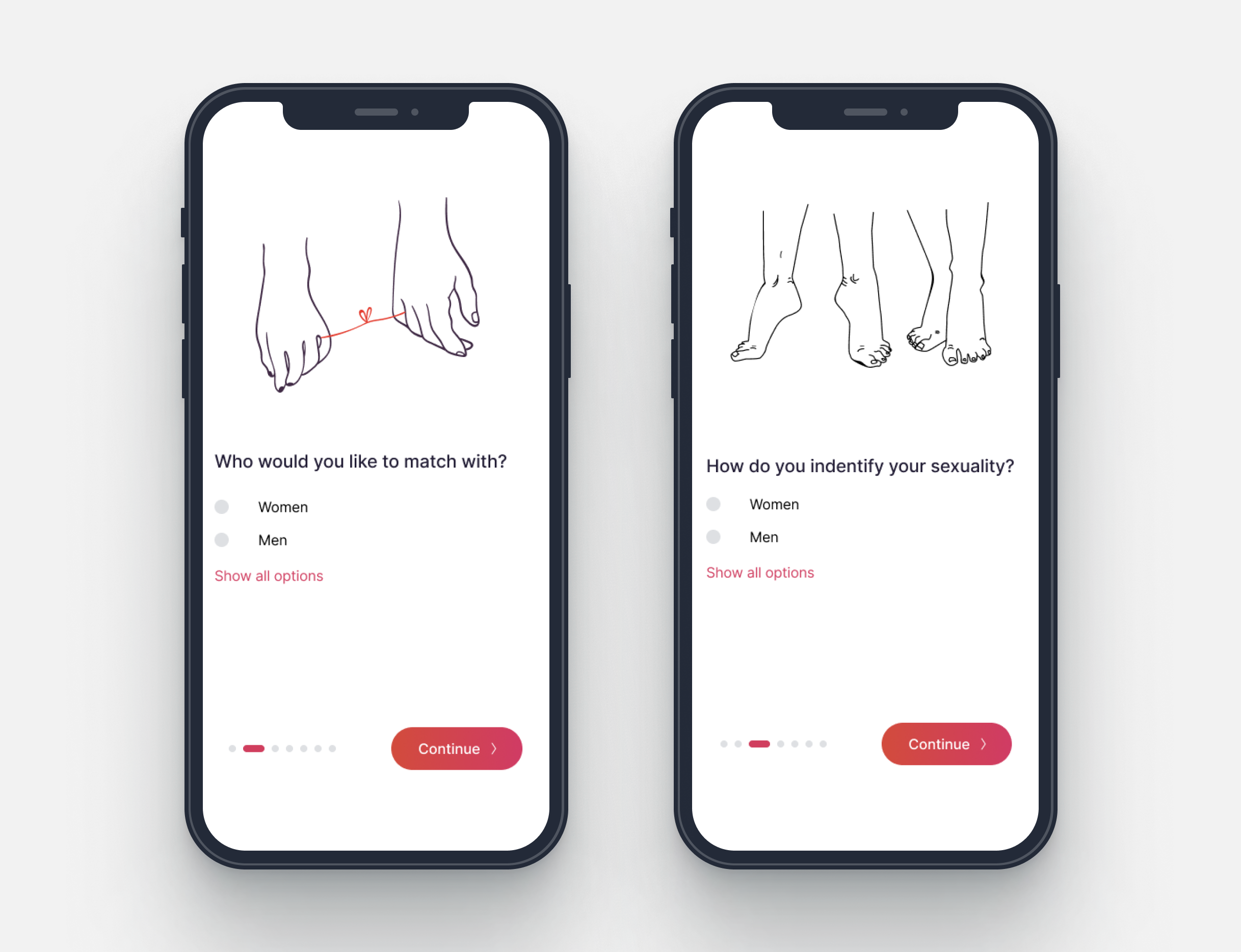
1 – Button Transitions: I provided the team with button states so that they can give users cues for transitions
2- Transition Animations: Move in transition was added between the onboarding pages.
3- Stepper: My other suggestion was that changing the colors and the positioning of the stepper would render it more visible.
4- Graphic Elements: To differentiate two pages even further I designed drawings for each of the onboarding pages.
This assumption was validated when the A/B tests were run in which one variant gender and sexual orientation questions were collapsed into one page, whereas in the other the two pages were differantiated with different graphics reppresentation as well as transition animations.
şadfks
THE CONCLUSION
This case was one among millions of why motion design was a crucial ingredient for human computer interaction, but it had a significant impact on my journey of interaction design.